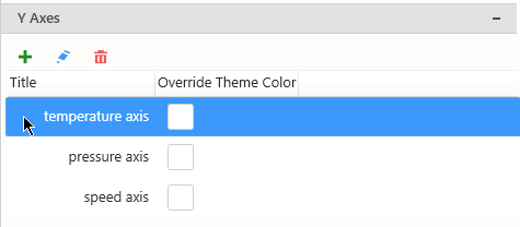
All Y Axes are listed in the right side in the properties, under section Y Axes :
Managing the list of Axes
Adding
By default, only one Y Axis exists, named after the first Y Value Series field.
Click the + icon to add a new Y Axis.
This opens the Edit Axis configuration pop-up window to let you configure this new Y Axis.
See below for Configuring.
Editing
Click the pen icon to edit the currently selected Y Axis.
This opens the Edit Axis configuration pop-up window to let you configure this Y Axis.
See below for Configuring.
Removing
Click the trash icon to remove the currently selected Y Axis.
Binding a Series to a Y Axis
When a new Y Axis is created, no Series are bound to it.
To bind a Y Value Series to a specific Y Axis, see Series Settings.
Y Axes Properties
Title
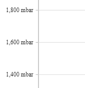
The Y Axis Title can be customized of hidden :
Color
By default, the Labels and Title colors are based on the Theme.
If you want to set a specific different color, check Override Theme Color and set the desired color :
There is also a shortcut in the list of Y Axes :
Grid Lines
Grid lines can be hidden or displayed with Show Grid Lines :
Value Type
By default, the Y Axis Type is “Numeric” : this means that the Y position of points directly maps to the numeric value of the Y Value Series data field.
The Type “Logarithmic” can also be selected : this means that the Y position maps to the logarithm of the Y Value Series data field.
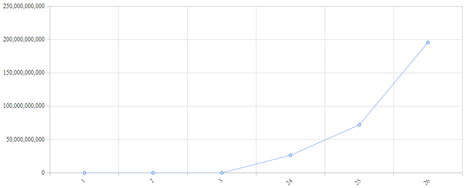
For example, here is a simple chart with Y Axis as “Numeric” (default) and X Axis as “Category” (default) :
The variations happen on many orders of magnitude, and it’s difficult to track what is the real trend.
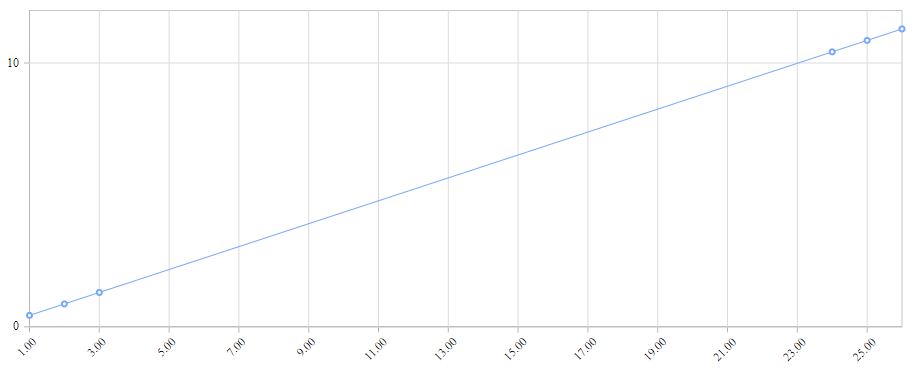
With a “Logarithmic” Value Type of the Y Axis, and Numeric for the X Axis, we see that the trend is exactly exponential :
Force Axis To Start at 0
By default, the minimum and maximum value of the Y Axis is automatically calculated to scale to the data displayed.
Instead, you can force the zero to always be included on the Y Axis.
This is useful for example if you want to display absolute variations compared to the total value.
To enable this behavior, check Force Axis To Start at 0 :
Custom Range
By default, the minimum and maximum value of the Y Axis is automatically calculated to scale to the data displayed.
Instead, you can force a Custom Range :
Position
Each Y Axis can be positionned to the Left or Right :
Hiding the Axis
All the Y Axes can be hidden by un-checking the Visible box.







Post your comment on this topic.