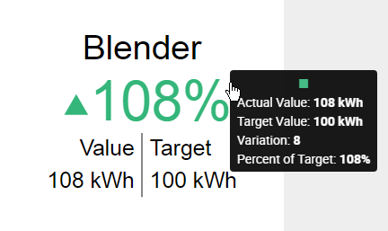
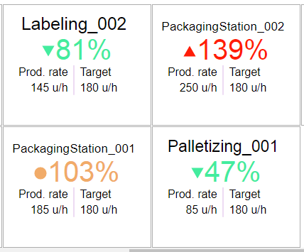
Depending on how it’s configured, the Card displays several informations :
Each part can be configured, as detailed below.
Configuring KPI, Left Value, Right Value
For each of KPI, Left Value, Right Value, the following can be configured :
Show/hide
Each can be displayed or hidden by checking Show Value (or Show KPI) :
Type
The value displayed at each position can be one of several types :
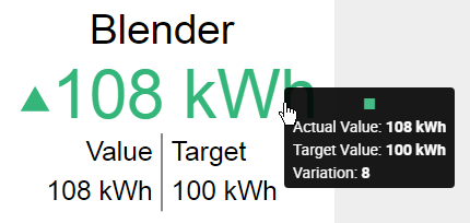
Absolute Difference
Shows the difference between the Value and the Target.
Calculation = Value - TargetPercent of Target
Shows the % of value to target
Calculation = 100 * Value / TargetActual Value
Shows the value of the Value field itself.
Calculation = ValueTarget Value
Shows the value of the Target field itself.
Calculation = TargetPercent of Change
Shows the % of variation to target.
Calculation = 100 * (Value - Target) / TargetColor
The value displayed at each position can have :
- the Direction Color that depends on the distance between the Value and the Target, and whether we consider that “good” or “bad” (see below “Colors and result interpretation”)
- or a Custom Color that is fixed
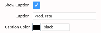
Caption
The Caption can be displayed or hidden by checking Show Caption.
The Caption’s text and Caption Color can be configured :
KPI Value formatting
The calculated KPI has its own value formatting, because it is a calculated value and isn’t listed for Value Formatting.
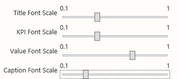
Element sizes
The relative font sizes of elements can be configured :
This Font Scale is relative, so that it remains responsive when the widget is viewed on different devices.
Colors and result interpretation
The font and symbol of the distance to target has a color :
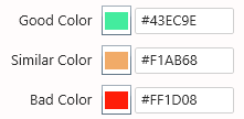
- green for “good”
- yellow for “near target” or “similar”
- red for “bad”
High/Low Is Good
You can define high values as being “good” or “bad” by selecting the Direction configuration in Colors :
- with High is Good, values that go above target will be displayed with the Good Color, and values that go below target will be displayed with the Bad Color
- with Low is Good, values that go above target will be displayed with the Bad Color, and values that go below target will be displayed with the Good Color
Thresholds for the “similar” state
Instead of displaying the “similar” state only when the value equals the target exactly, you can configure thresholds to accept an interval of values that are similar to the target.
These lower threshold and higher threshold are configured under KPI thresholds :
Other colors
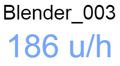
When no Target is configured, only the Value is displayed, with a constant color.
This color can be configured under Default Color :
The Separator Color can also be configured :
Full detail or KPI only
By default, when the Card has a Target Value, it displays both values as text, as well as a KPI with its value as text.
It is also possible to instead simplify this display and have only the KPI in a very readable way.
For this, select Show Indicator Only :
Title style
The Title is especially useful when a “Split into many Widgets” field is bound.
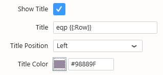
It can be hidden or shown, the text, position and color can be configured :














Post your comment on this topic.