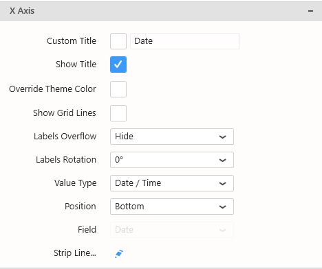
X Axis configuration is located in the right side in the properties, under section X Axis :
Title
X Axis has a default title generated from the name of the currently displayed data field.
If you wish to customize this title, check the box Custom Title, and write a new title :
Hiding Axis Title
Use the Show Title check box to hide or show the title on the axis.
Color
By default, the Labels and Title colors are based on the Theme.
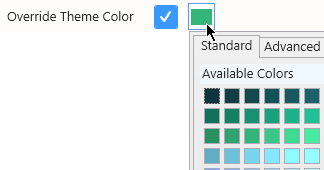
If you want to set a specific different color, check Override Theme Color and set the desired color :
Axis Ticks and Labels
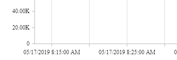
The Axis displays ticks at regular intervals with the X value of the corresponding position displayed as a text label.
Grid Lines
The Axis can display “Grid Lines” aligned with the Ticks, to let users have visual marks of what is the X value at this position.
Grid lines can be hidden or displayed with Show Grid Lines :
Labels Overflow
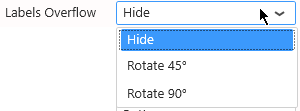
When Axis Labels are too long to be displayed, the following behaviors can be configured using Labels Overflow :
Hide
Labels are displayed entirely in their original orientation, but the labels that overlap are hidden :
Rotate
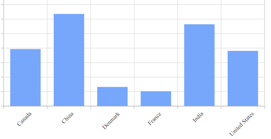
Labels are displayed entirely, but if the labels overlap they are rotated to give more space :
Labels Rotation
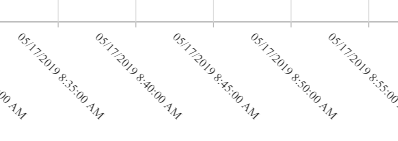
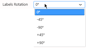
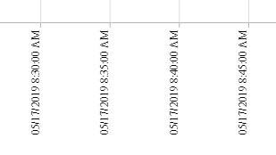
The Axis Labels orientation can also be rotated for better readability, by setting Labels Rotation :
It can allow for example to fit more labels when using the “Hide” Overflow Mode :
Or alternately to take less space vertically :
Ticks interval
On Date / Time type of Axis, by default, the interval between Ticks on the Axis is calculated automatically (depending on the widget size, value range, labels size, etc)
This allows to have a responsive behavior : the ticks will always fit nicely.
Instead of letting the interval be calculated automatically, you can input a Custom Interval :
This will force the the Tick interval to the value selected.
Value Type
Sometimes you want to compare groups of values side by side, and the distance on the X Axis doesn’t matter.
Other times, the distances on the X Axis are meaningful and you want to show how close or far the points are horizontally.
This is what the X Axis Value Type setting is for :
Category
This is the default, and the only option available for text type of fields.
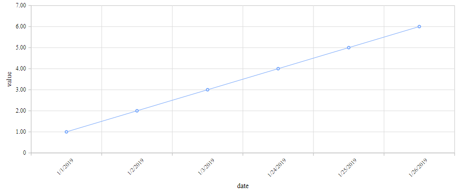
With Category X Axis type, all items on the X Axis are equally spaced.
Date / Time
When the data field is of type Date, DateTime or Time, the Date / Time option is available.
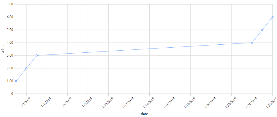
The X position of points depends on the time difference in the data.
For example, the following data has missing points between day 3 and day 24 but this is not clearly visible and the progression looks linear :
With Date / Time type, the real trend is visible :
Numeric
When the data field is of type Number, the Numeric option is available.
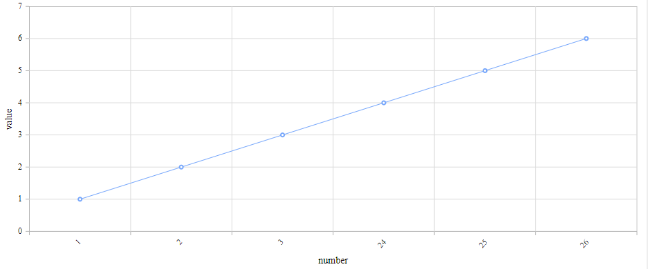
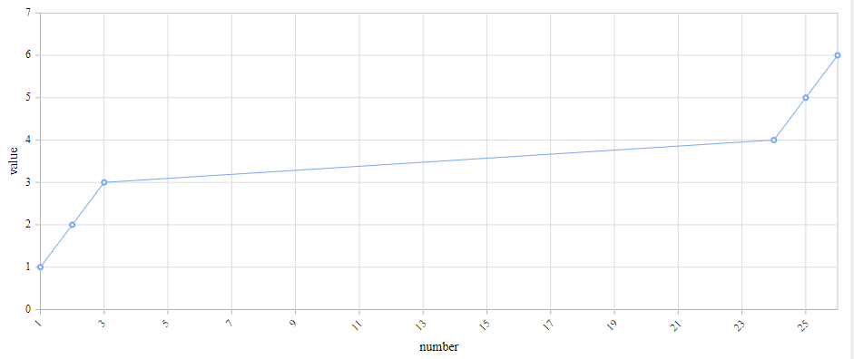
The X position of points depends on the number difference in the data.
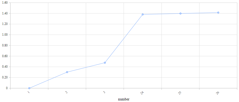
For example, the following data has missing points between X value 3 and X value 24 but this is not clearly visible and the progression looks linear :
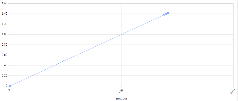
With Numeric type, the real trend is visible :
Logarithmic
When the data field is of type Number, the Logarithmic option is available.
The X position of points depends on the number difference in the data.
For example, the following data has missing points between X value 3 and X value 24 but this is not clearly visible and the progression looks random :
With Logarithmic type, the real trend is visible :
Position
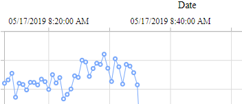
The X Axis Position can be set to Top instead of the default Bottom :










Post your comment on this topic.